Beautiful Orsolina28
I spent some time looking on awwwards.com for a website to review, because why not? It’s important to keep yourself inspired and up-to-date on cool design trends so you don’t get left in the dust…and it’s nice to take a break from the daily grind to see what others are doing!
Upon arriving at awwwards, the “Site of the Day” photo at the top interested me, it was for a website called Orsolina28 created by Adoratorio. After clicking on the link, I was brought to their beautiful site. I was a little hesitant while the initial site was loading because the load animation made me a little motion sick, but it gracefully loads you into the site and main banner.
Now, I’m not a dancer by any means. I am probably as awkward as it comes when trying to “get down” to a song (well, I feel like it anyway). But I do find ballet and other types of dance hypnotizing and not boring at all. Anyway, this isn’t a blog post about me, so to save your sanity I’ll move on.
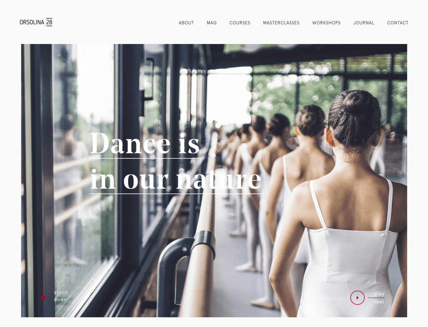
The thing that really pulled me in when I arrived at the site was the video that you can click into. I noticed this immediately while scrolling down the page, probably because the little circle on the right hand side is outlined in red (the scroll down animation on the bottom left side of the banner is fun too!) Without getting too in-depth, the video completely pulled me in and I wanted to learn more about this stunning place (its in Italy, by the way so no wonder it’s stunning.) It would have been cool if the video loaded in that banner instead of bringing you to a separate page, but either way it was great.
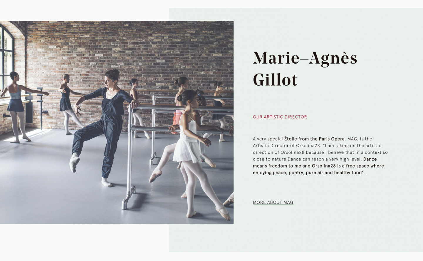
Scrolling down off of the banner there is a block of text in a unique serif font (Noe Display) with a hover effect of a pastel color highlight their company name. This link will take you to their about page. Underneath that text block is when it starts to get more interesting. I love how they break the grid to showcase a photo and pastel teal color block to the right and behind that. The typography on top of that color block is done so well. This is a nice way to bring attention to the Artistic Director of the company (see first photo below).
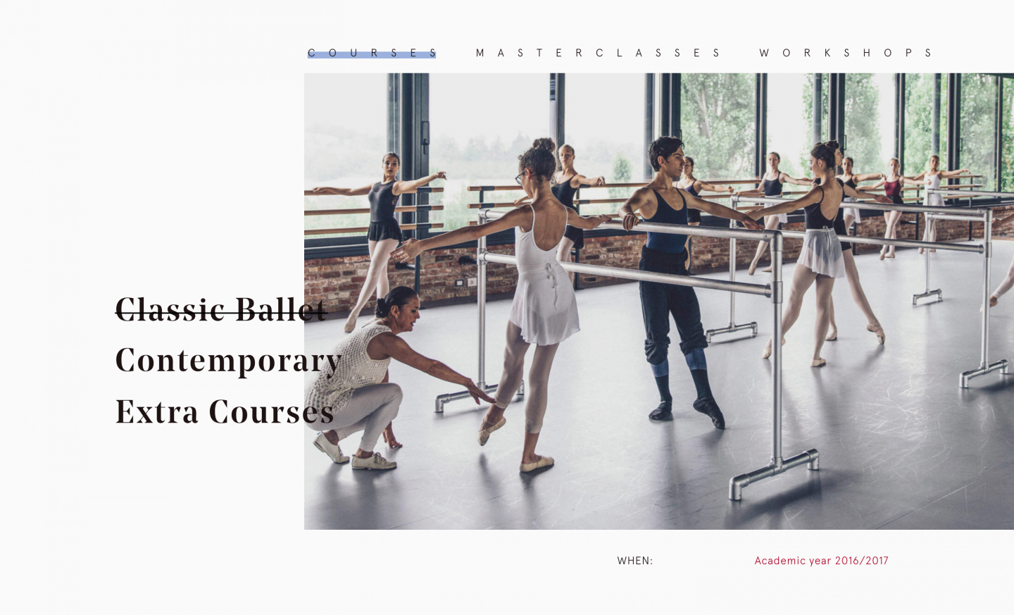
The section under that is very unique as well (see photo above). Again, this portion breaks the grid with a sub-nav on both the side and top of a picture. The type of dace on the left, and the types of classes on the top. Personally, I’m not a huge fan of the cross-out hover effect like is done on the words to the left, but it makes the words stand out. The nav at the top of the photo is the same hover effect as the rest of the website, blue pastel highlight. I do think this effect and color scheme works well with the type of business this is. I also appreciate the pops of red they have throughout, It helps important information stand out.
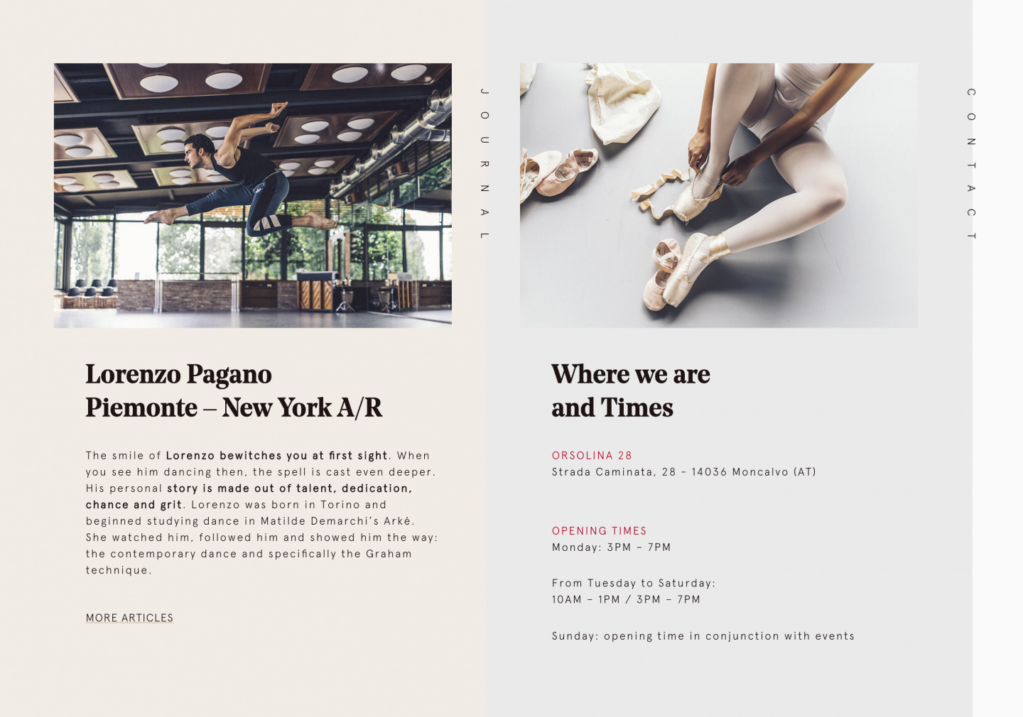
Lastly, you are nearing the footer when you come across a 50/50 split a journal entry and a callout with the address and times Orsolina28 is open, both sitting on a pastel color block. The footer is nice and simple, only displaying the 28 logo, social media links and contact info.
The interior pages are all designed a little different, but have a similar design style. Since I talked more in depth about the homepage, I’ll just bring some attention to some favorite design elements throughout.
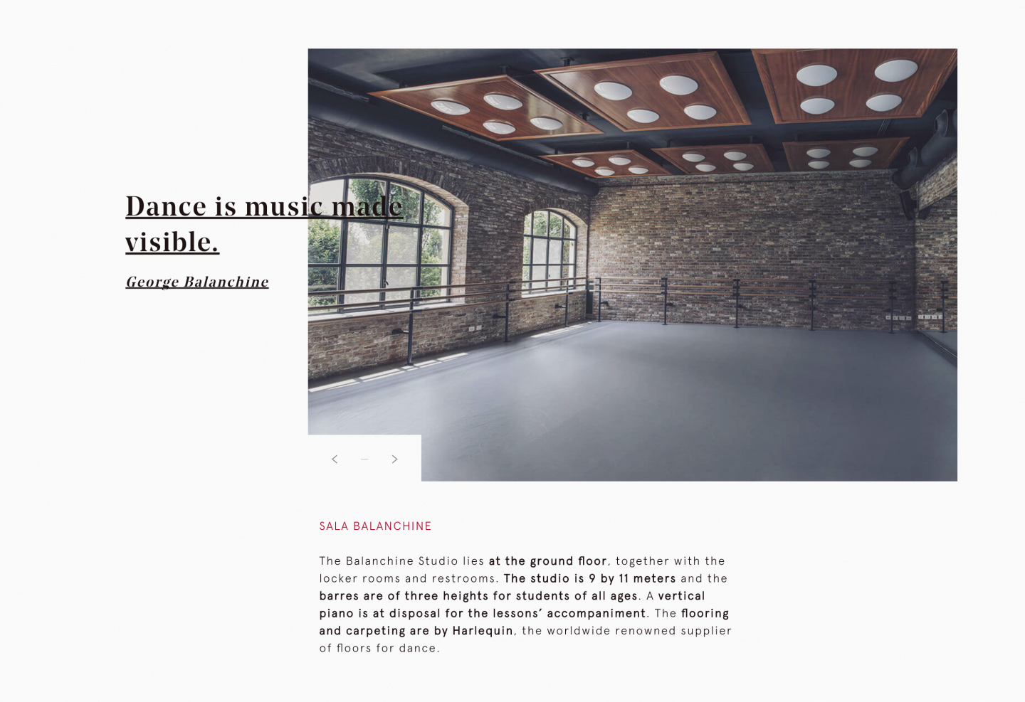
- It’s easy to notice that the photos throughout are gorgeous and really capture the atmosphere there. From the different dance classes to the property photos, you can really understand the environment.
- I like the other page links down at the bottom of every page. It’s convenient and allows you to seamlessly go through the website.
- The photo galleries on the pages are a little uncommon and cool; they look very custom. The movement of the photos when you go through the gallery feels like it relates back to the movement of the page load (on each page), which is interesting.
- The bold content in the lighter, san serif font (Apercu light) allows important information to stand out and makes the content layout more interesting.
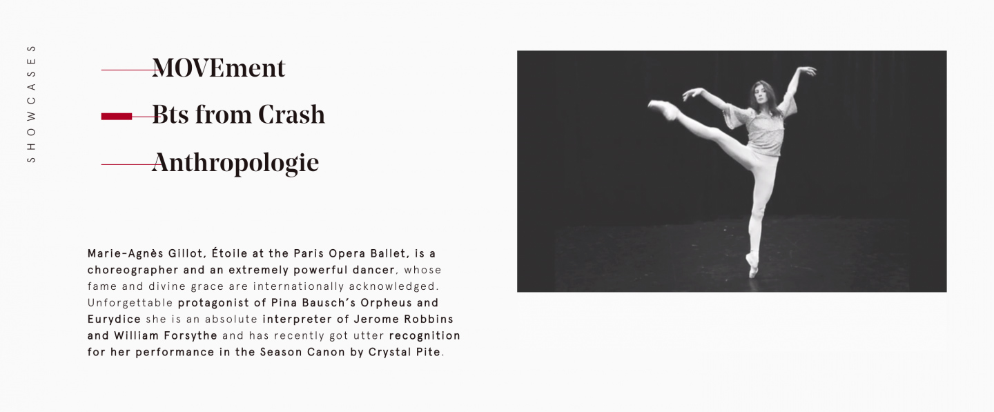
- On the MAG page, showcasing the Artistic Director Marie–Agnès Gillot, they have some of her showcase videos that you can watch. Hovering on one of the 3 options starts the video to the left. This was a neat effect.
- The section titles being vertically aligned throughout brings even more interest into the design. It’s a nice added element and ties sections together.
- When you go into a different tab in your browser, you will see that the Orsolina28 tab goes from being the company name to “oh nooo…come back!” I thought that was a fun touch!
So, even if you don’t have a danceable bone in your body, I’m sure you can agree that this dance company website is quite stunning. All of the elements go together so well and the color scheme works so nice. Sections that break the grid really makes this website stand out and keep you interested. Photos and video really play a big role in making this website unique because they capture the environment perfectly. Kudos to you Orsolina28 on your beautiful website and awwwards recognition! The design team really did a great job.