As you all know, there are always trends that go around the web design community. Remember when parallax images were really “in?” I apologize to the readers who still use parallax, but…I got to tell you it has most definitely lost the “cool” effect. Anyway, our team has seen a trend starting that we have given the name of “The Stripe Effect”. We’re not necessarily sure that it’s started with Stripe but that’s just the starting point of when we started to notice it and comparing other sites to it.
Let me start out by saying that we have nothing against the Stripe website. We actually really like it! But that’s just it, many web designers do. And you can tell because of other websites that are designed very similar. Is it possible that the website for Stripe was actually based on another website that looked similar? Of course. I guess what I’m trying to say is that no matter who started it, it is most definitely a trend now.
“Okay, okay we get it! It’s trending, but what exactly is it?”
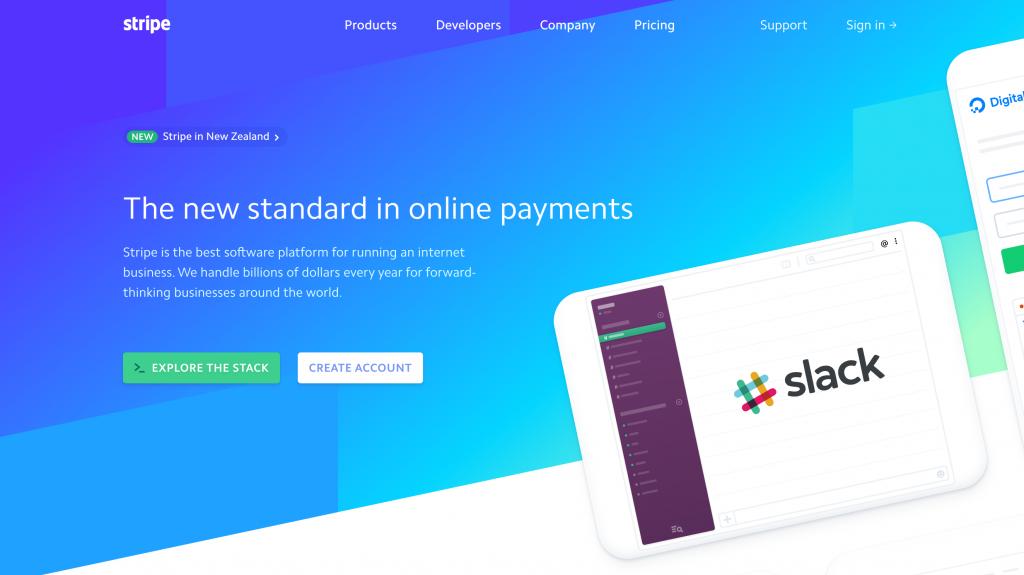
I’m so glad you asked! If you look on Stripe’s website, you can see that it is pretty unique. It uses bright and fun colors, breaks the grid a lot, uses gradients, has a lot of flat vector illustrations/renderings, likes to cut their backgrounds diagonally (instead of straight horizontal lines), and has many light blue-grey backgrounds. Reading this without looking at the website you might be thinking, “That’s it? That’s the ‘Stripe Effect?’ It doesn’t sound so unique or different”. Well, before judging so harshly, take a look around their website.
“I’m following you, can I see other examples of ‘The Stripe Effect’?”
Okey dokey, now that you see what I mean, let’s look at examples of this trend that I found while looking on DesigkMunk.
I’ll start with Algolia.
As you scroll down the homepage, you can see that it has a similar color scheme to Stripe. It uses flat device mockups as well as small animations around the homepage. Algolia also uses blue/grey backgrounds throughout that are cut diagonally, another Stripe staple. I noticed that Algolia pages change colors and shapes based on the product page you’re on and Stripe does this as well. You also can’t forget the gradients (these sure are coming back into style, aren’t they?). Overall, nicely designed site of course, but you can see the similarities.
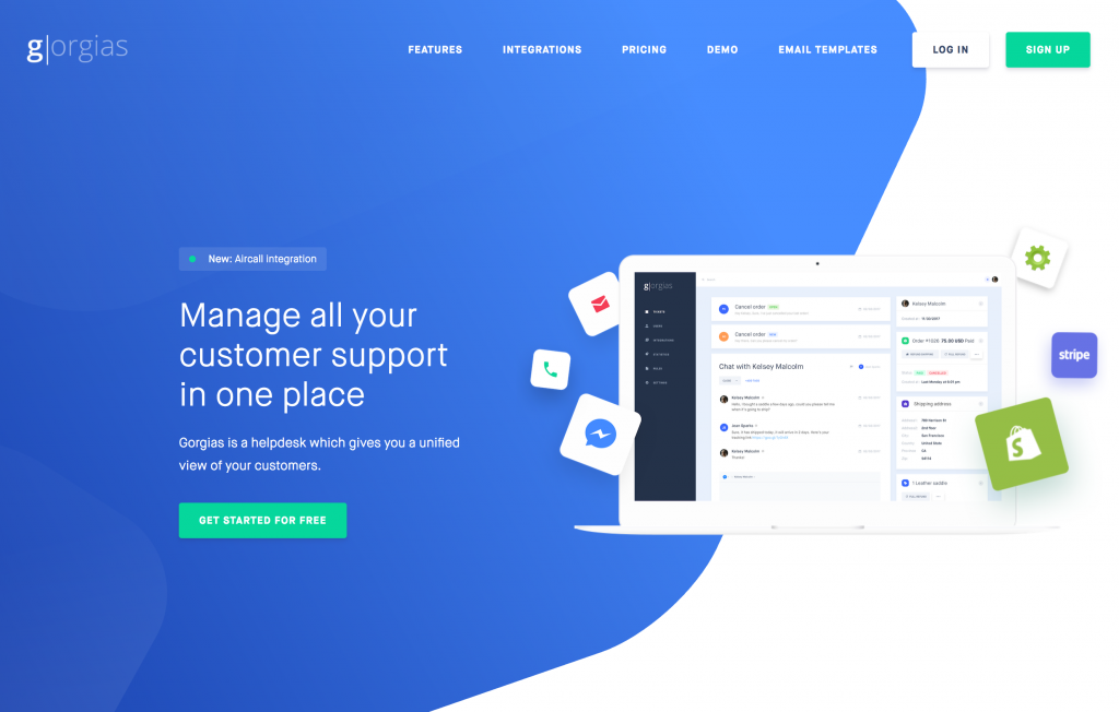
Gorgias is another related site.
This one you can see right off the bat that it’s very comparable. Just looking above the fold you can see that not only does Gorgias have a very close relation of color to Stripe, but even the layout and objects are familiar. As you scroll down, you can see the usage of the blue/grey background as well. They don’t seem to cut their background colors on a diagonal but instead have a blue shape throughout that has a diagonal top and bottom. This web design is fairly different in that every page is pretty similar to the homepage. Stripe has more of a variety/colors. Again, this is another similar but different design.
The last website I will compare is Statsbot.
Statsbot has much of the same feel as the others and is very in-tune to the Stripe site design. Again, there are gradients and many flat design mockups/icons. I haven’t pointed out yet that some of these sites, including this one, have icons with a round background that are above (or next to) each section, like Stripe. Of course, this site also has the blue/grey backgrounds, however, they are not cut on a diagonal.
If you’re still interested in seeing other examples I have found that follow many of these design aspects here is a list: Evrybo, Scale, Recruitz.io, Smooch, District0x, Chatwood, Assembly, Codeverse, & Baianat.
“Cool, this is an interesting trend. Do you think it’ll stay around?”
While “The Stripe Effect” is neat, I’m sure it will start to evolve into something else. Look at it this way, if everyone starts designing sites similar to Stripe then it will be too saturated with the same design. Users will get so used to seeing the same thing that it will be hard to get their attention to your brand because it looks so much like everyone else’s. We have and will always have trends that everyone loves, but they always get replaced with the next best thing, that’s just how design works.