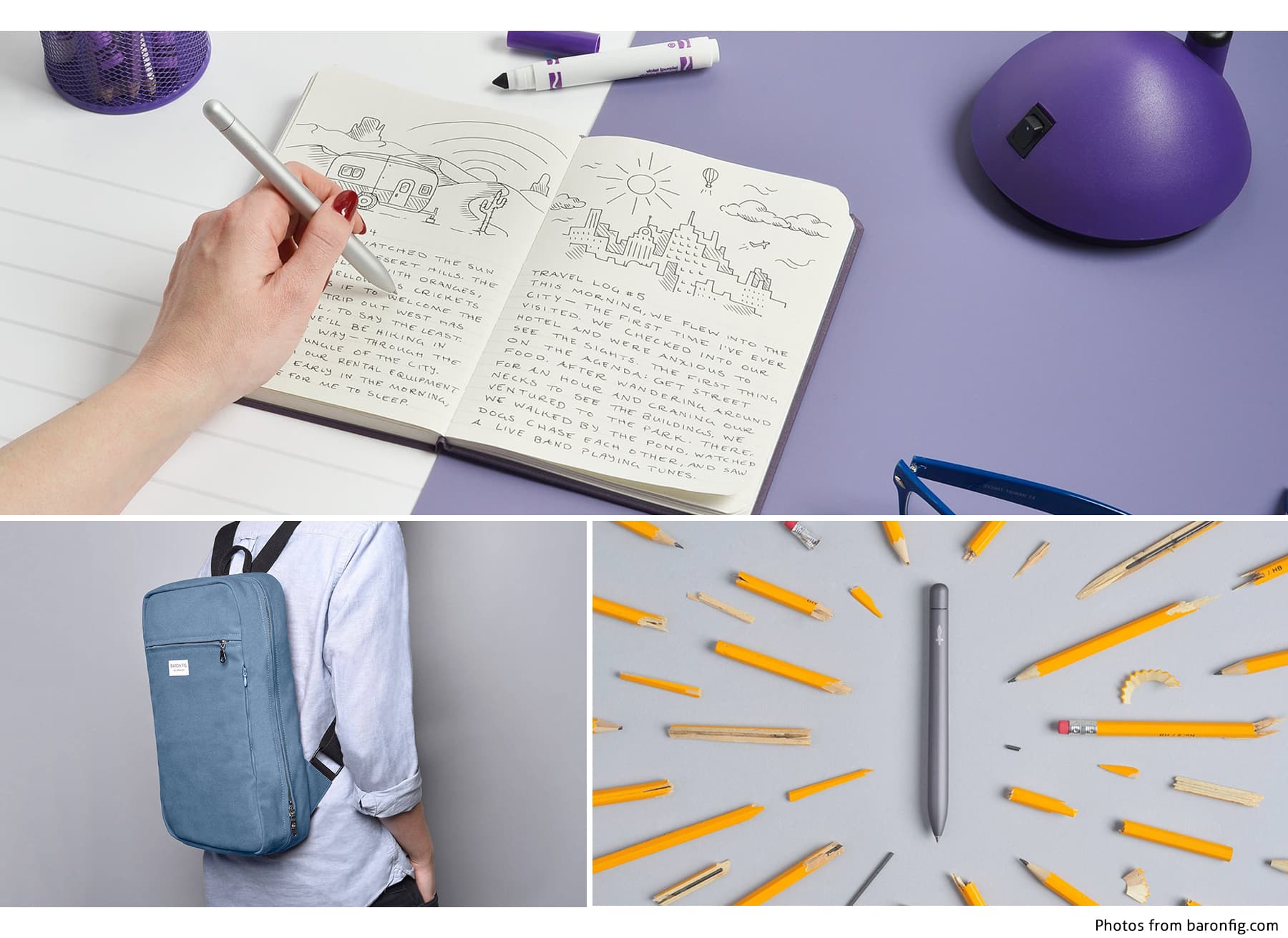
Who doesn’t enjoy an easy-to-use, nicely designed, and organized website? I certainly do. That’s why I was glad to find Baron Fig through a dribbble.com shot by Justas Galaburda. Curious about the company’s name, I clicked on the link in the shot to find their e-commerce site where they sell unique sketchbooks, pens, bags, and other accessories that encourage creativity.
Homepage
Baron Fig’s homepage is very simply designed and to-the-point. The banners images are very fun and really bring their products to life. I personally think it gets a little busy above the fold with the banner and the 3 callouts underneath (the text gets a little difficult to read). I do like the range of products you see between the 4 call to actions (CTAs), however. As you scroll down through the rest of the page, the illustration in the CTA about their story brings some more of their personality into the mix and the footer is very nicely constructed. I like how they have the logo and social links in the middle and the important links on the left side.
Scrolling back up to the main navigation, I like that they chose to have their shop links on the left and logo in the middle, it makes it really easy for the user to get right into shopping. I also like how the middle logo stays consistent all the way to the bottom of the page. If you are looking for the rest of the menu, you have to click the three dots. This took me a second to realize the first time I came to the site only because it’s not the normal, condensed, hamburger menu you usually see. Regardless, I think it works fine and like the look of it when clicked on. By the way, I love the mega menu when you hover over “shop”! Easy to navigate and find exactly what you might be looking for.

Shopping Experience
Clicking into the Notebook shop page is where it starts to get very enjoyable for anyone who likes grids and organization. They have a sub-nav under the page name with anchor links on the page, very easy to navigate. If you’re like me though, I usually like to scroll through the page first and see the products, especially when everything is laid out so nicely.
I really like the 3 callouts that are continued onto the product pages but changed based on what category you are looking through. The dark violet, blue and purple colors all work great together and the images are awesome. The hover effects on each notebook add a little personality and I love that you are able to click through the different colors available for each book. Being able to see different versions of the products in the listing view gives such a good user experience because the user doesn’t have to be taken to another page to view different variations of the product. Who knows, this may lead the user to purchase the products more easily (I’m no marketer, but it makes sense to me!).
The product pages really breathe life into the product. Take the Vanguard landing page, for example. They show you what every color looks like and what the features are in these beautiful photos and illustrations. I also appreciate the small button that slides down the right-hand side if you are interested in purchasing the product. Other pages that have the purchasing option right at the top of the page, like the Squire Rollerball Pen, also have great scroll-through as well. I especially love the illustration of the construction of the pen. You can tell that Baron Fig really takes time to plan and photograph their products to give the user a great experience throughout the site.
The Facts
So, to wrap this up, you should definitely take a look through the rest of their products — they’re pretty cool. I’m dying to hold one of their pens! I could go on and on about the design, but Baron Fig really looks like an awesome company in general. For every notebook sold, they plant a tree. Helping save the planet, check! You’ll find many things on their site to inspire you to create whatever you like to create, from their podcasts to their projects. There is something for everyone on here. Well done, Baron Fig and their website design team!