I’m sure all of you are thinking the same thing by now, but really, where did first two months of the New Year go? It’s bad enough that the past year flew by and unfortunately, 2018 doesn’t seem to be going any slower. Anyway, its that time of year where the design community likes to discuss the topic of what design elements the New Year will bring in with it. Now that we’ve settled into 2018, here comes my opinion of what type of web design trends we’ll be seeing more of this year.
1. BREAKING THE GRID
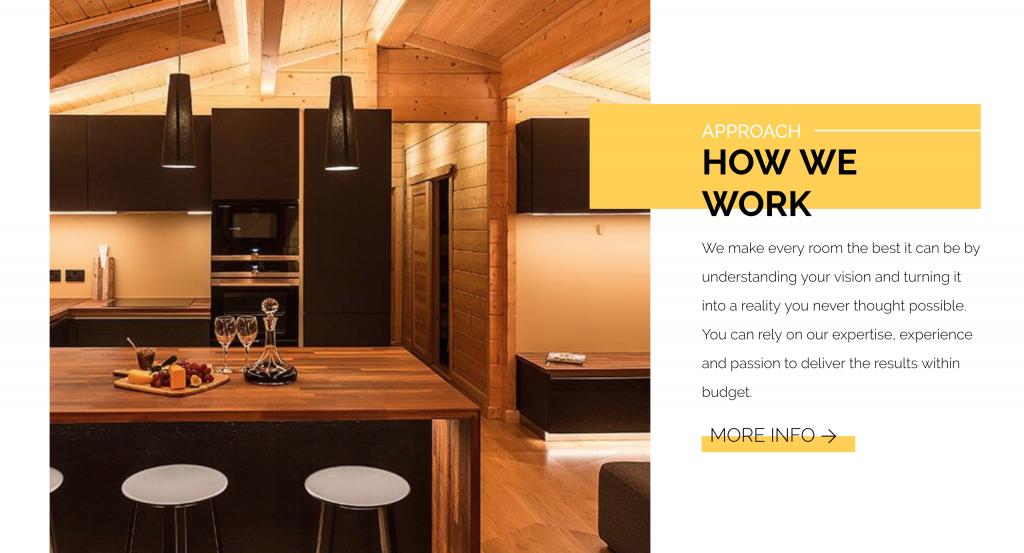
By no means is this a new concept, but I wouldn’t say that it’s a widely used practice just yet. We’re so used to designing sites that stick to the gridline but those get more and more predictable as the years go on. By breaking the grid we add a lot more interest for users that are perusing around our designs and make them want to stick around and continue to look through it’s pages. You do see this idea used more frequently now so you’ll definitely be able to find some great inspiration.

2. ILLUSTRATIONS
Most of the time you’ll see websites that are mostly dominated by beautiful high-res images. You’ll notice, however, that you’re starting to see some sites predominantly using illustrations. For certain markets, it makes all the sense in the world to have fun illustrations with a little pop of color added to the pages. Don’t forget, there are so many types of illustration work that you see around. So, even though it may be a more seriously toned site, there is still a unique way to add something illustrated, whether it’s a device, animal, or person. Either way, I think it’s a safe bet to say that we’ll probably be seeing more on sites this year. There’s just something about illustrations that I think we find relatable in some way or another.
3. “THE STRIPE EFFECT”
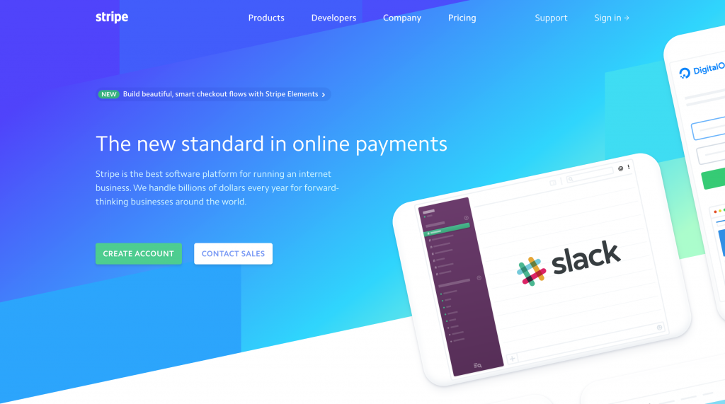
If you read my posts, this title will sound familiar to you. I wrote a blog post specifically on this idea that us, as a company, were noticing. You see many site designs that have the same look and feel as sripe.com. Now, who can say whether or not this was the first site to have that type of layout/colors, but it’s certainly not the last. I’m sure we’ll be seeing even more variations of this in the New Year.

4. GRADIENTS
I’m not sure if you have noticed yet or not, but gradients are back in. As soon as Instagram changed their logo to include one it seems like I have been seeing them all over the place, and have even used them myself from time to time. Take a look at the Stripe website screenshot above…look familiar? I definitely see this blooming more into 2018 for sure.
5. WEB DESIGN TOOLS
Everyone has their favorite apps to design websites but it seems like new ones keep popping up all over the place (or it does to me, anyway). We are currently using Sketch but there seem to be a lot of cool options for designers out there right now. We love the integration between Sketch and InVision because we use that to show the designs to our clients. As I’ve learned, however, that’s not the only app that does what Sketch is doing. InVision’s Studio hasn’t been fully released yet but some are getting early access. Adobe XD is another cool one that people seem to be excited about. Lastly, Figma is another one that I have heard about as well. I haven’t tried any of these yet, besides sketch, but have heard great things about them. Feel free to leave comments on this post with your favorite program, I would love to know what you use!
There you go, folks! My opinion of what I think we’ll see more of in 2018 are these 5 trends, for a start. I’m sure there will be plenty of new design ideas, programs, and formats but I think what is listed above will be pretty prominent as we go throughout the year. As always, I’m looking forward to see what the design community comes up with and even what you, the reader, thinks about these ideas. Good luck to you all in 2018!